« Back to Facilities Management News Home
« Paints & Coatings
Expanded Paint Line Targets Improved Aesthetics
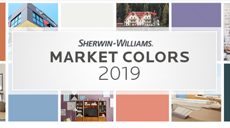
Influenced by everything from the latest fashion trends to the surrounding environment, color trends are always changing. Inspired by these trends and the 2019 Colormix Color Forecast, Sherwin-Williams has created 23 new palettes to help professionals transform their clients’ spaces with the power of color. These palettes were created for the New Residential, Commercial, Multifamily, Healthcare, Hospitality, Education and Home Owners Association markets.
“Choosing the right color can help inspire, motivate and guide customers in spaces they encounter during their daily lives,” said Michael Plank, director of color marketing and design services at Sherwin-Williams. “We created these palettes to provide professionals with an easy resource to help them use the latest color trends in every type of project, from a remodeled hospital to the latest coworking space.”
Commercial
From the growing popularity of working remotely to the rejuvenation of brick and mortar stores, the Commercial palettes transform the spaces that people spend the most time in outside of the home. A modern update to classic pastels, the light, airy colors of Sweet Retreat provides versatility to help make the office feel like home and work seem like play. Inspired by modern tech, the Power Play palette is filled with daring colors that generate a futuristic energy to transform any space into a work of art. Simplistic and rural, the rich and complex colors of the Natural Ground palette brings comfort into offices and retail spaces and pair seamlessly with wood, stone and brick.
Healthcare
The palettes in the Healthcare market are primarily designed to make patients and guests feel at ease while away from home and to evoke motivation and optimism to get them through the trying journey ahead. Fun-focused and lively colors make up the Upbeat Energy palette to promote inspiration and motivation in areas like pediatrics and physical therapy. Accent patient and staff rooms with the cool greens and blues found in the Connected Calm palette to evoke a feeling of familiarity and relaxation. Achieve the next level of luxury with the earthy and sophisticated colors of the Cozy Living palette to transform a senior living community into a home. Hospitality Inspired by everything from past decades to cultures from across the oceans, the Hospitality palettes bring guests on trips of a lifetime through the use of color. A mix of eye-catching, nostalgic pastels combines to create the playful Retro Revival palette, providing a fresh take on retro motel décor by adding a perfect splash of color both inside and out. Bolder is better with the bright, striking colors of the Electric Exploration palette creating an aesthetic that explodes with energy and life. The Off the Grid palette is a breath of fresh air, drawing from rustic western heritage. The colors reflect forests, deserts and other earthy elements of the great outdoors.
Education
The Education palettes were designed to encourage concentration and inspire curiosity in students while energizing the spaces around them. Ideal for a learning environment, the soft, chalky colors of the Nurtured Nature palette form a sensory connection to the outdoors and the organic, neutral aesthetic encourages concentration from students of any age. The bold and bright pops of color in the Bright Futures palette add visual interest and energize school spaces, perfect for guiding students from classroom to classroom. Statement colors in the Global Student palette inspire curiosity and pair well with brick, stone and wood to evoke a rustic aesthetic.
More From 12/19/2018 on FacilitiesNet