 Architecture Demarest
Student Housing That Offers Security, but Remains Inviting
Design offers safe spaces for residents, but still able to attract future tenants
In a previous article, developers considered strategies and insights to optimize security in the increasingly competitive market of student housing. Today, these developers are using site features to optimize the unique and desirable traits to maximize security.
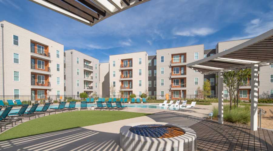
In the case study of the Northside student housing project, near the University of Texas, Dallas, courtyard-shaped building layouts offer security and privacy for the residents while remaining inviting to visitors and potential tenants.
Important considerations include space optimization and the design of multi-use flexible spaces, the accommodation of public transit, and accounting for needs that began to arise as the Covid-19 pandemic struck midway through the project.
The pandemic made the team more mindful of flexibility to accommodate a variety of evolving health needs and opened dialogues with many developers about how to adapt future projects and establish best practices. As these strategies became part of the conversation, the realities of Covid started to inform project planning and the team contemplated what they could do to create environments that respond to the health/safety needs but also address the emotional responses everyone had to the pandemic in order to make people feel secure in a space.
Balancing private and public spaces
While the site offers shared amenities and public access, pools are centered in the middle of the courtyard to control access and provide privacy. The location of the pool and clubhouse is typically a key consideration because developers want it to be visible from the leasing office, both to attract new residents and to allow staff to monitor activity. A courtyard layout allows this type of control to happen naturally, with the building as a defining special envelope.
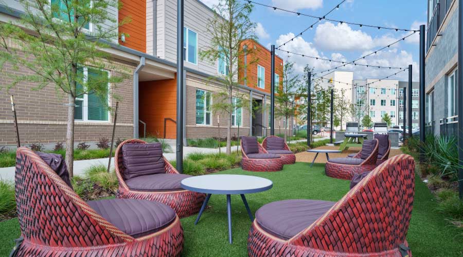
The project consists of four phases. The first two have courtyard-shaped buildings along with L-shaped buildings with pocket parks distributed throughout, for use by residents as well as passersby. The goal was to balance private, secure spaces designed specifically for residents, with open, public spaces to draw in pedestrians with alluring green space, contrasting with the urban streetscape around the community. Aesthetically, the pocket parks diffuse the large buildings and hard edges to provide a softer and more inviting experience.
Phase One started with a courtyard-shaped building featuring the pool in the middle, alongside a wide breezeway that fronted the leasing/club area, serving as an implied entry point into the building. The breezeway provided transitional space from outside to inside and served as a node where people who entered could choose to go into the leasing area, club, mail room, residences, or the pool area. It was a trajectory from which residents could choose their next destination.

As potential tenants came into the leasing area through the main entrance, they were channeled by the widened breezeway area and could see intriguing glimpses into resident life: the courtyard, pool, mail center, etc. The goal of clustering these features was to amplify the energy of residents coming in — having fun at the pool/clubhouse, using the fitness area — and allowing potential residents to see these activities happening.
Phase Two added a two-story covered plaza branded with the name Paseo, which was located in a prominent corner of the building, where the two lower levels were designed completely open. The Paseo was adjacent to the leasing area, with an entrance to the clubhouse. The Paseo essentially functioned as a gateway between Phase One, which was on the south side of the property against the main street, and Phase Two, directly behind it with access via the spine. While the Paseo was a public space, efforts were made in the design to protect the privacy of residents. The pool is visible but not accessible from the Paseo and access is controlled to keep non-residents out of the clubhouse and the mail room beyond it.
Shifting focus to outdoor spaces
While each phase had its own character, the overall project was developed along similar themes. The pool/amenity spaces became more playful and less formally organized with subsequent phases. Phase One had a more traditional student housing pool with programmed areas for sunbathing/lounging/volleyball, while Phase Two expanded into a resort-style pool. The design team enhanced the development’s quality with fixtures, finishes, and amenities in Phase Two and the Paseo was designed to be a segue into the community to attract potential residents.
Phase Two also expanded the courtyard area into something that was notably more spectacular than Phase One of the project. Phase One was the quintessential off-campus student housing design with defined amenity spaces: pool, volleyball, barbeque, etc., whereas Phase Two expanded and built upon these amenities.
The pool itself became more of a free-flowing organic shape with a zero-entry and water features, and the deck was expanded to accommodate more patio furniture and give the area a resort experiential feel. The pool area was larger, allowing more people to use it.
Phase Two also obliquely fronted a large park space, which had been previously developed and was more functional than in Phase One, providing open, versatile green space. In the courtyard, three sides were comprised of units and the fourth was a multi-story parking garage where creative landscaping was used to screen out lights and noise to prevent disruption of the courtyard vibe and maintain a human scale. The remainder of the courtyard space beyond the pool was geared toward a versatility of outdoor leisure activities.
Phase Three included some additional outdoor spaces and sought to inject more density into the project. On the southeast corner of the site, developers put a small, freestanding commercial space with two tenants at the edge of the park. The space addressed the main street while green space separated it from the residential areas behind. In Phase Three, there were no changes to the pool, it was all about the moment between the buildings and enhancing existing features to increase utilization in preparation for Phase Four. More intimate outdoor spaces were added, with the scale of a backyard in relationship to some of the units in the complex. Building on the pocket parks in Phase Two, these new spaces weren’t exactly hidden, but were geared more toward the residents than the public, with more of an introspective concept and less connection to the spine and main road synergy than Phases One and Two.
Phase Four had even greater density but expanded on Phases One and Two by sheltering the pool space while also providing strategically located glimpses so prospective residents could come to inquire about the development which builds excitement from the outside in. Phase Four is also close to a forthcoming rail line so the team sought to mitigate acoustics which would come into the outdoor spaces from the rail line.
Phase Four had two courtyards. The first was a larger, traditionally styled, and more active courtyard with a pool and outdoor games. The second was smaller, irregular shaped, and designed to be more passive, with small seating clusters for just enjoying the outdoors in a restful state. Creating these two separate experiences was unique about Phase Four, in contrast to Phases One and Two, which had large, programmed courtyard spaces. Phase Three had quiet pockets distributed throughout the space, while Phase Four combined the two concepts.
Related Topics:


