Color Palette Trends Turning Rich and Global
July 1, 2016
Colors in interiors coatings are turning moody and intense, reacting to turmoil around the world and increased cultural blending, say paint manufacturers.
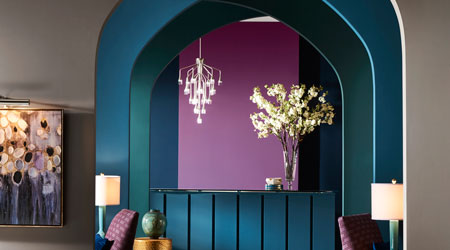
At NeoCon in Chicago, Sherwin-Williams announced its colormix for 2017, saying its four color palettes "share a vision of renewed spirituality, body and soul nourishment, and a determination to define a sense of self." The colors are largely bold and saturated, featuring colors such as peacock blues and saffron yellows.
PPG announced its 2017 Color of the Year is Violet Verbena, "a greyed-off moody purple," which is said to be able to defy convention and chameleon to suit a wide variety of settings and audiences.
With an increased trend toward a residential feel in commercial spaces, facility managers may find their palette of options widening from safe beiges. More muted choices would play well in offices, conference rooms, or patient spaces, while the more vibrant and intense offerings could find a home on accent walls, waiting areas, grab and go food spaces, and more.
Another way to incorporate colors in corporate spaces is through the furniture systems. Among the neutral white, black, and grey offerings, an abundance of manufacturers exhibiting at NeoCon this year provided accents and options in burnt orange, reimagined avocado, and brilliant cerulean.
This Quick Read was submitted by Naomi Millán, senior editor of Building Operating Management magazine, naomi.millan@tradepress.com. For more on using colors in commercial interiors, go to https://www.facilitiesnet.com/14494bom
Next
Read next on FacilitiesNet