Use Bright Colors For Collaboration, Be Careful With Multiple Colors When Selecting Paints
One general tip most designers agree on is to use the brightest colors in areas of collaboration. "Use colors that are high energy in spaces where high energy is expected," says Nabors. "That's often in areas where there is a lot of collaboration." But Nabors cautions that a single color is usually best — as opposed to going overboard with lots of different colors. "I really like big single moves of color," he says. "The last thing I want is to pick a color and have it be part of a muddy canvas of colors."
Even with single color selections, though, there are a few different options and a few things to keep in mind. One very important consideration is how the color will look under the lights — both artificial and natural (if applicable) — of a space. "The quality of lighting makes a huge difference in how a color looks," says Secor. "Color can look completely different on different sides of a space." Secor says to make sure to understand the type of lighting in a space — fluorescent, LED, natural — and if possible, test the color under that light before committing an entire space to it. Otherwise, facility managers may discover a color looks very different than they thought it might.
To add a little more drama to a space with single colors, Nabors says playing with sheens or hues of the same color is a good strategy. "You can make stripes on a wall that are really the same color," he says. But just like with multiple colors, be careful not to go overboard and make a space too busy.
Find Your Way
As open office plans have become more open, there's a tendency to use color to direct occupants and visitors through a space, as well as signal changes in space functionality.
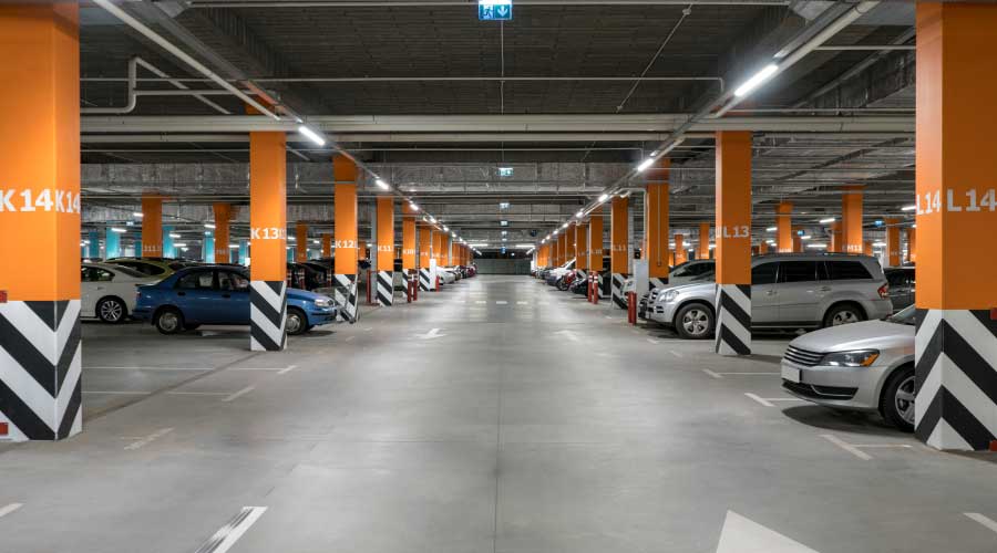
Secor says using color as accents, as opposed to huge swaths of color, to designate wayfinding is the best tack to take. That's a strategy Nabors says he agrees with, though in another way. "I use color to paint a door and a doorframe to match the wall for doors people don't need to use." So really the lack of accents is signaling to the occupants not to go there, or as Nabors puts it, "it's not really using color for wayfinding. I'm actually not using color for wayfinding."
Oftentimes, says Nabors, hallways are no longer delineated by walls, so passing from one area or department to another isn't as obvious as it might have been in the past. "I like color in a big single move to help orient the occupant," says Nabors. "Of course, this is most important in areas that have lots of visitors." Color can subtly indicate to a visitor that he or she is in a new area. But, again, "color in office space always goes back to balance," says Secor. Having too many colors, even for wayfinding purposes, in a relatively small space can defeat the purpose and be distracting to occupants.
Lastly, keep in mind that of all the interior products, paint is the least expensive way to get color in a space, says Secor. "It's easy to change paint," she says. "It's not as easy to change other interior products." But that shouldn't be an invitation to get carried away. Choosing color for a space really does require a measured, considered approach, and it's important to remember that every space is different.
"I can't imagine a single rule about paint color that has not been successfully broken," says Nabors.
Related Topics:


