Tips to Smooth Interior Paint Selection
Decisions about color don’t have to be purely subjective if facility executives keep some basic points in mind
Confidence on the job is something top facility executives usually have in abundance. They’re confident in their ability to run their department, run their buildings and to deal with the C-suite. But there is one area of a facility’s design where even savvy facility executives may lose that confidence: color.
When working on a team for a renovation or new construction project, facility executives often defer color decisions to other people. But what if the color scheme chosen doesn’t take into account what the occupants prefer or what kind of work is being conducted in the space? It may be up to the facility executive to rein in some wild ideas. Familiarity with color theories and principles can make facility executives more effective on any project involving color decisions.
Sometimes, in organizations that don’t have the budget for a designer or on a small renovation that doesn’t justify a designer, facility executives have to make design choices themselves. Or the facility executive could simply be heeding a call for a new wall color or carpeting. That can throw facility executives into very unfamiliar territory.
“They’re making decisions they’re not comfortable with,” says Dana Jenkins, design director at Gensler. Often, she says, because facility executives are fearful of choosing the wrong color, the space goes “vanilla” and bland because the colors are grayed out or washed out in an attempt to keep colors neutral. That’s when you end up with “pinky-beige,” a dull, cliché color notorious for its overuse.
There also appears to be a gender divide when it comes to choosing color, Jenkins says. In her experience on projects, men usually defer color choices to women because they have a certain insecurity about choosing color. In some cases, the facility executive may be color blind — a condition that affects more men than women.
Whatever may be causing the lack in confidence, “facility executives need to take the fear out of the mix and go with a more emotional, gut decision,” Jenkins says. “It’s only paint.”
Psychology of Color
Color has a great impact on a space, says Cheryl Brown, principal, interior designer with SmithGroup. “It humanizes the space, makes it welcoming and creates a sense of scale. Color makes the space come alive. It’s a memorable experience and a defining one.” Given those aspects, it’s important to get color right. Luckily for facility executives, there are very few “wrong” color choices. Understanding some basic color theory can arm facility executives with the confidence to make appropriate color decisions.
Any color in a space will have an effect on the occupants’ emotional state, mood and behavior. The study of these effects is called color psychology. “We all have certain emotions that may be evoked by certain colors,” says Jocelyn Stroupe, principal, director of health care interiors at OWP/P.
It’s important to note, however, that color psychology is not an exact science. A color that may evoke anger in one person may make someone else sad, based on their culture, upbringing and experiences. Studies into the effects of color on emotion have contradicted each other, especially when conducted cross-culturally. However, there are a few basics that are generally accepted as the norm in the United States.
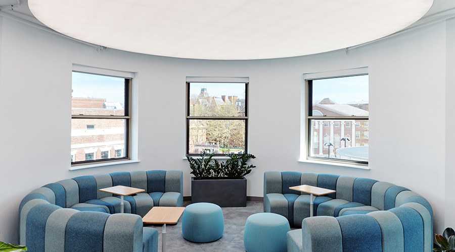
The most basic theory and one that is probably most widely accepted is the effect of color temperature on mood. The color wheel is divided into two sections: warm and cool tones. The warm tones include shades of red, orange and yellow. Cool tones are greens, blues and violets. Warm tones have the effect of energizing a space and its occupants. A typical example of using warm colors appropriately would be in a collaborative space of an office. “In collaborative mode, warmer colors are perfectly reasonable because they’re stimulating,” says Jenkins.
Cool tones are calming and relaxing. They’re better suited to areas where people are often stressed, says Stroupe. In health care spaces, that might mean family waiting areas and lobbies of areas like the neonatal intensive care unit, where families are often under pressure. In office spaces, cool tones might be better suited to areas where employees perform a lot of heads-down work that requires focus and concentration.
Another factor to consider specifically in health care spaces is the effect of color on human skin tone, says Stroupe. “Using the wrong colors could lead to misdiagnosis of a patient,” she says. For example, yellows and greens are avoided in clinical spaces because they make skin appear to be jaundiced. In other areas of a health care facility, however, green can denote life and yellow can bring energy and warmth. Do not rule out any colors unless there is a specific clinical reason in health care. Red, for instance, is a difficult color to use in health care for obvious reasons, says Stroupe. But that isn’t to say it’s never used; it just needs to be used in the correct way.
Educational facilities, especially K-12, follow some simple guidelines for color use in classrooms. Younger children, from kindergarten through third grade, can handle very saturated color, says Jenkins. “That doesn’t mean the colors have to be primary,” she says, “but they can be intense.” This works well in the atmosphere of primary schools by serving to energize and excite students about coming to school and being in the classroom. Once children get older, however, colors need to be more quiet, grayed out and less saturated, says Jenkins. “As the children increase in age, the colors should get quieter and cooler.” This will help older children — who aren’t necessarily thrilled about going to school — concentrate and focus with fewer distractions.
Wayfinding
Besides affecting the emotions and moods of the occupants of a space, color can also serve to differentiate between spaces. When used correctly, color can give occupants clues to orient themselves in a facility.
Some orientation techniques are subtle. For example, when you enter a building, there’s usually an entryway which opens to a larger area, like a lobby, says Brown. That area then may break off into smaller areas again, like hallways and meeting rooms. Each one of those areas may have different color schemes that are consistent throughout the facility. For example, in a university building, hallways and common areas may have warmer and more intense colors, while smaller spaces like classrooms and computer labs may have cooler, less saturated tones. This subtle effect is meant to subconsciously tell the occupant what type of space they are entering. “You go from a noisy level to a quieter study zone and you inherently know,” says Brown. “Color helps with that visual connection.”
Obvious orientation techniques are important elements of wayfinding systems. Besides signage, wayfinding can use all sorts of visual clues to help occupants and visitors orient themselves in a facility. For example, many hospitals rely on a multitiered wayfinding system. Signage is heavily used, but color cues reinforce the signage. Colored floor tiles or carpeting often literally mark the path from the lobby to the radiology center, for example.
In larger medical centers, techniques like this are especially helpful, says Stroupe. “People arrive and they’re usually already stressed. Providing the right visual cues is important,” she says. “Color can be used very effectively in addition to a good graphic and sign program.”
Off the Wall
When facility executives think about adding color to a space, sometimes they only think about paint and walls. There are other surfaces to consider that are just as important to the overall color scheme and feeling of a space. Neglecting to give parts of a space the same amount of thought as the walls could lead to a very unorganized and confusing color scheme.
Flooring is often overlooked when facility executives consider the entire color scheme of a space. That may happen because flooring isn’t at eye level, as a wall is. But attention should be given to the floorcovering because it will comprise a much higher percentage of the budget than paint. It’s also a long-term investment, while paint color can be changed over the course of a weekend for much less money.
As a rule, it pays to go with a more neutral color for the floor because it is a long-term investment. “Generally, anything you’re spending a large amount of money on, you’re spending on neutrals,” says Jenkins. Because the nature and purpose of a space may change long before the floorcovering wears out, it’s important to have a neutral basis for any future color palettes.
“I always start with flooring because it always seems to be the backdrop of the space,” says Brown. “It plays an important role because of the quantity and scale of the material. I like it to be the backdrop, and then put color on top of that so there are specific focal points.”
Sometimes, facility executives are dead-set on using a less-neutral tone in the flooring. “If you want to make a stronger color statement with the flooring, that’s fine,” says Stroupe. “But you need to understand what that means for the rest of the space.” Using a bold color on the floor may mean toning down the color palette in the rest of the space to avoid sensory overload. If that’s the look the organization is aiming for, however, then go for it, Stroupe says.
Practical Matters
When choosing colors for any materials in a space, be sure to consider the lighting. If possible, the ideal situation is to bring swatches and samples to the actual space being renovated to see what they look like under the space’s specific lighting. If that’s not possible, then find out what the lighting will be and find a similar lighting setup to view the swatches and samples. Colors, especially paint colors, can change drastically from one type of lighting to the next. If the space has natural light, consider that as a separate source of lighting and view the swatches and samples in daylight throughout the day. Colors will look different at noon than at dusk. “Make sure the lighting complements the colors and vice versa,” says Brown.
When choosing paint colors, don’t forget about aspects of durability, especially paint finishes. Generally, high gloss paints are more difficult to maintain because they show wear and tear more easily. Satin, matte and eggshell finishes are easier to touch up. If there is a specific color that will be difficult to maintain because of the tone or finish, don’t be afraid of using it. Brown recommends putting more delicate paint colors in higher areas that are out of reach of the occupants. That way, the space benefits from the color without having the maintenance hassles.
Related Topics: