Case Study: Lighting's Role in Return to Work
The regional office for CIMA+ had its lighting designed for employee comfort and collaboration May 3, 2024
Canadian engineering firm CIMA+ relocated its Ottawa regional office. Since the old space was spread over multiple floors, the company's primary goal was to unite the team in one unifying, dynamic environment. It also hoped to encourage employees to return to the office post-Covid while enticing potential new teammates.
Local firm 4té inc. was hired to design the new 13,000 square foot office space in Ottawa’s Gloucester neighborhood, and the result is professional yet inviting. CIMA+'s branding is visible through a palette of soft grays and greens without being too literal. And playful Eureka luminaires are featured in several key employee spaces.
One of the unique features of the overall floor layout is its four rounded corners. 4té transformed these spaces into distinctive collaborative zones, each with its own signature, but all with a focus on the employees.
The largest and most prominent of these is the staff kitchen and lounge. This lively space was a key design element to enable the team to come together for meals, relaxation, casual meetings, or special events as required. An industrial ceiling gives the room extra height and is painted a darker gray. Eureka’s Mika luminaires are suspended between bright green acoustic panels, providing general, diffused illumination over banquettes and a pool table.
Scout cylinders, in a 4.5-inch diameter, are suspended over the kitchen counter and tables along the window. The pendants highlight each area while providing direct illumination down to the workspaces. Scout's pale green color truly pops against the darker ceiling.
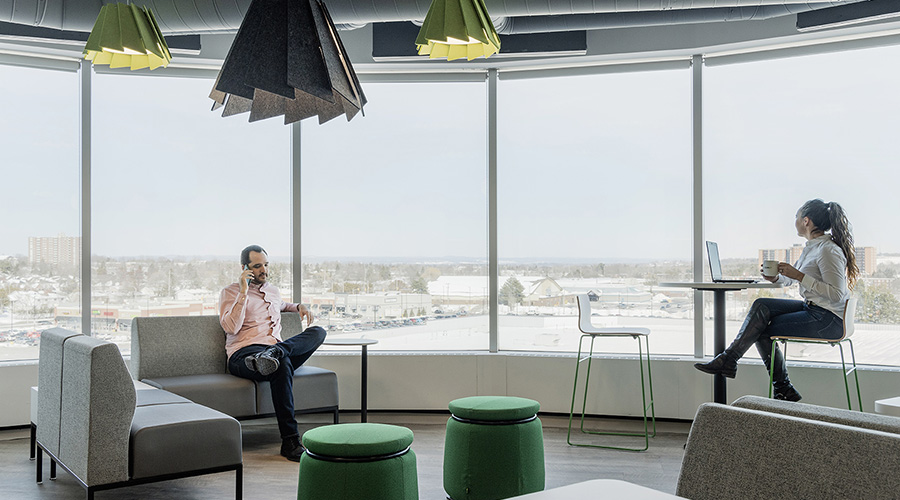
A small seating area at the far end of the lounge invites people to enjoy the view while working or relaxing. Boyer-Casey selected three Mute pendants to illuminate the space. Two 16-inch diameter fixtures in pear green and one 32-inch fixture in charcoal add interest and illumination. And because the combination of open ceilings and glass windows tends to amplify noise, Mute’s acoustic panels contribute to sound absorption.
Eureka’s Caldera pendant is used to animate another collaborative corner. The furniture is intended to be reconfigurable, so it was important that employees could move things around without being dictated by the lighting above. The large-scale rings provide an elegant aesthetic while offering broad, comfortable haloes of illumination with minimal glare.
Workstations are not assigned in the new office environment. So, the company wanted to create an employee space with lockers for coats, boots, and site safety equipment. The high-traffic area is a transition space between employee entrances, a main corridor, and adjacent open-concept workspaces. Noise was undoubtedly a concern. Three Mute pendants illuminate the benches and storage areas. And their charcoal felt panels complement the custom cabinets below while absorbing sound.
Feedback from CIMA+ has been very positive, reporting that its employees have been very responsive to the new design.
Next
Read next on FacilitiesNet


