Lighting
What makes a well-lighted space?
Lighting is frequently taken for granted, creating problems for occupants and increasing costs. The fact is, some lighting is good and some is not. Employees aren’t expected to be comfortable and productive working in a cold room or sitting on uncomfortable furniture, so why should anyone expect them to be comfortable and productive working under bad lighting?
When it comes to good lighting, what most people think about first is quantity. But quantity is only one component of good lighting, and it is just the beginning. After a certain minimum lighting quantity is reached, other factors become much more important. The minimum depends on what light level is needed — a moonlit night or an operating room both offer appropriate light for different situations. The point is more is not always better, and too much light usually is just a waste of energy.
Looking more closely
Because lighting quantity, measured in footcandles, is easy to ascertain, it is often used as a measure of lighting quality. But simply looking at light levels on the horizontal work surface says nothing about the quality of the visual environment.
Another key factor in determining lighting quality is glare. In spaces where people spend long periods of time or have important visual tasks to perform, glare sources should be eliminated. Glare occurs when something is so bright relative to the rest of the environment that it causes discomfort or reduces a person’s ability to see.
In the 1980s and 1990s, concerns about glare focused on reflected glare from computer screens. With the advent of flat screens with low-reflectance coatings, this is no longer a significant issue. But glare is not just limited to sources directly in front of a person. Recent studies have shown a person can perceive glare sources from directly above, known as overhead glare. Glare sources of concern in offices today are lighting fixtures themselves, windows and direct sunlight.
The quality of light is not determined solely by the sources of direct light. Research indicates that, in spaces like offices and classrooms, bright walls and ceilings are preferred and increase comfort. When room surfaces are perceived to be too dim, a space can feel dark, regardless of the light level on the task.
One way to make rooms feel brighter is to light ceilings and walls with indirect light sources. Those surfaces become the light source for the room, and the lighting is even and glare-free. It doesn’t have to cost more to light walls and ceilings: Light levels can be reduced, and the space will still be perceived as bright.
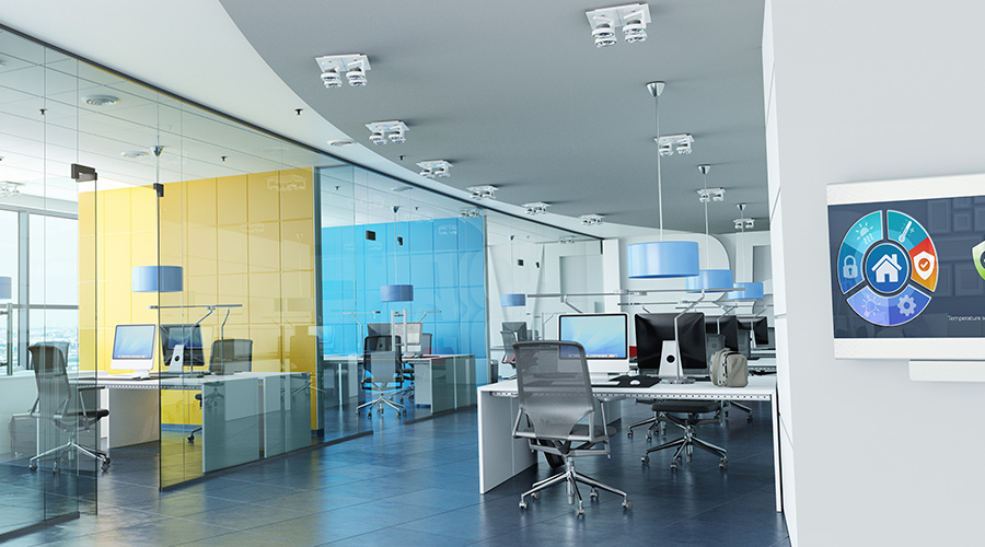
The fixture type most commonly used for indirect lighting in most spaces is the pendant linear fluorescent uplight. These come is all shapes, styles, output and prices.
Be aware, however, that when the ceiling is less than 9 feet high, pendant fixtures become a problem because they might hang too low. In open offices where furniture plans are fixed, one way to solve that problem is to hang the pendant linear fixture above the spine of the cubicles where no one will walk. Over furniture, fixtures can be hung as low as 6 feet, 6 inches and still be above eye-height. Furniture-mounted uplights or fixtures built into hard partitions or casework are other possibilities.
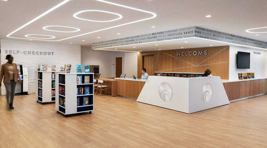
A hot trend in office lighting is the use of so-called “recessed indirect” fixtures. These are typically 2-by-2 or 2-by-4 fixtures with a perforated basket in the middle concealing the lamps that cast light up to a curving white reflector. Although these fixtures look better than the generic parabolic or lensed troffers, they can be a source of glare. Bright fixtures in the ceiling are not a substitute for indirectly lit ceilings, especially in large open areas.
Not too much, not too little
Another important factor in lighting quality is brightness balance. The relative brightness of various surfaces in the field of view must not be too different. In an open office environment these surfaces can be categorized as the task itself, the task’s surrounding area, such as desk and cubicle partitions, and room surfaces, such as walls, ceilings and windows. Too much difference can cause eyestrain and discomfort. In an office, the task is often self-illuminated: the computer screen.
The brightness of a surface depends not only on how much light is falling on the surface, but also on the reflective properties of the surface material. A room with white walls will feel completely different than a room with dark wood paneling, even with the same amount of light falling on the walls in each. In office and classroom environments, dark partitions and walls should generally be avoided because they can produce contrasts that are too high and spaces that feel dark. Light-colored walls and partitions make spaces feel bright and help distribute light around the space, filling in shadows and making minimum light levels easier to achieve.
Given the preference for indirect lighting, it might seem logical to conclude that uniform lighting is the key to quality lighting. But some designers believe that totally indirect lighting is too bland and featureless, like an overcast day. A bit of direct lighting creates a little shadowing and reflects off shiny objects creating highlights and depth.
In offices or classrooms, effect can be achieved by using pendant indirect fixtures that have a partial direct light component — 20 to 30 percent of the total fixture output. In other types of spaces, such as building lobbies or retail stores, highlighting is achieved with accent lights or decorative fixtures. The trick is to do this without introducing glare, and to strike the correct balance between bland uniformity and too much shadow. In public spaces such as lobbies and corridors, good lighting design will create a visual hierarchy by highlighting objects and surfaces to identify what things are important and help visitors find their way.
Color rendering is another factor in lighting quality. Colors need to appear accurate, not dull or washed out. In typical interior applications, this is not a problem with current lighting technologies. Color rendition, the ability of a light source to render colors accurately, is measured on the 0-to-100 color rendering index (CRI) scale.
Lamps with a CRI of 80 or more should be used for best color rendition. These can be identified by an “8” or “X” in the last three digits of a fluorescent lamp model number. With fluorescent sources there is also a choice of color temperature, from warm to cool. The appropriate color temperature is based on room finishes and the color temperature of adjacent electric lighting and daylight.
There is evidence that control over lighting improves user satisfaction. Much like temperature or the height of chairs, lighting preferences vary among individuals.
User control
One easy way to give office workers some control is with furniture-mounted task lighting. Usually this is done with an undercabinet fixture or with a positionally adjustable task light. To avoid glare, undercabinet fixtures should always have an opaque front or be mounted so that the lens is hidden from normal view. Adjustable task lights allow the user to control not just the amount of light, but the distribution of the light as well. Adjustable task lights should be carefully selected to be sure that they are shielded so as not to cause glare. They also should use efficient compact fluorescent sources.
Another way to provide user control is with multilevel switching, also called dual switching. Typically, in a fixture with three lamps or lamp rows, one lamp or lamp row is switched separately from the other two. This allows for three levels of light — one, two or all three lamps. That gives the user control over light levels and can save energy, studies show. The user can simply turn on the amount of light needed based on personal preference and available daylight.
The Light Right Consortium recently tested various lighting techniques used in open-plan offices. The scheme that provided indirect lighting and user control was rated as significantly more comfortable than the schemes with only direct lighting from 2-by-4 troffers. The same study found that when workers have personal control of lighting they exhibited higher motivation and increased persistence and accuracy during the workday.
Like user control, daylight strategies can both improve lighting quality and reduce energy costs. Windows that provide views to the exterior environment are a positive feature that improves occupant comfort and satisfaction. Views give a connection with the natural environment and provide visual interest. Views allow occupants to rest their eyes with something to look at in the distance. Conventional wisdom may be that window views only distract workers, but in a recent study by the Lighting Research Center software engineers with offices near windows spent more time at their computers than those in windowless offices.
Daylight also can be a significant source of light for building interiors. A simple way to take advantage of daylight for energy savings is to separately switch the light fixtures near windows so they can be turned off when there is sufficient daylight. The drawbacks of windows are potential glare and heat gain.
The big picture
For a lighting design to be successful it must also address initial and operating costs, code compliance and architectural design compatibility. The designer should understand budget limitations; the facility executive, in turn, should be open to suggestions to spending a little more in one area and paying for it with savings in another area or in reduced operating costs. The question to ask is whether increased initial costs will reduce operating costs or add value in other ways.
Energy codes have become more prevalent; the federal government has mandated all states to have an energy code. The facility executive must ensure that the designer is complying with the applicable energy code. This will ensure at least reasonable energy performance. Quality lighting can often be provided using much less energy than the code maximum, resulting in lower operating costs.
For lighting to be high quality, it must be properly integrated with the architecture — treated as part of the architectural design. Lighting should be considered from day one of the design process. Visible and decorative fixtures should be compatible in style with the style of the interior.
As technology, codes and the needs of building occupants have become more complicated, it has become harder to produce quality lighting. Be aware of where design advice is coming from. Sales consultants provide useful information and may offer design advice, even complete designs, but remember that their job is to sell certain products. Beware of trendy technology and sales hype. A professional lighting designer, whose job is the constant evaluation of new technologies and products, can help with the correct application of technology.
Glenn Heinmiller, LC, is with Lam Partners Inc., an architectural lighting design firm in Cambridge, Mass.
Tips For Better Lighting quality
Here are some considerations to take into account to maximize lighting quality in facilities:
- Use indirect lighting whenever possible.
- Make sure there is light on room surfaces, especially walls that are deep into the space and far away from windows.
- Avoid fixtures that produce glare or seem unpleasantly bright or visually dominant.
- Avoid dark furniture and large expanses of dark wall finishes.
- Control direct sun entry and overly bright window walls, without completely blocking beneficial daylight and views.
- Provide user control. Consider adjustable task lights at desks and use multilevel switching in private offices and classrooms.
- Consider a task/ambient approach. Instead of blanketing the space with the highest light level, provide a lower level of ambient light and specific lighting at task locations. This approach can save energy.
- Use basic energy controls. Separately switch fixtures along windows and use occupancy sensors in private offices, classrooms and similar spaces.
- Use lamps with a color rendering index rating of at least 80.
|
Related Topics:


