Brightness and Variety Are Challenges To Office Lighting Quality
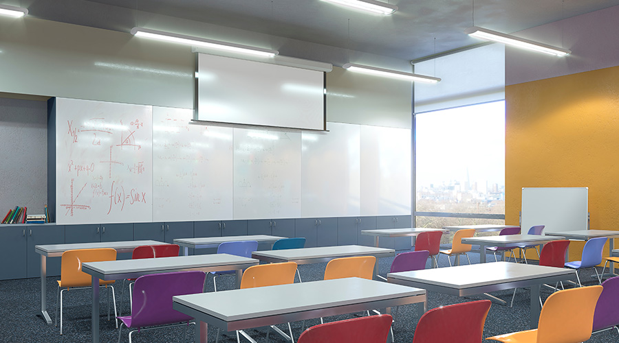
Getting a space to seem bright is essential to good lighting design. Because of new regulations, the amount of energy consumed by the lighting system has to be reduced. New technology helps get more brightness out of less energy, but it's also important to pay attention to the rest of the space. In a holistic, coordinated design, light reflectance values of the walls, ceiling, furniture, partitions, and floor become part of the visual package for illumination, says Graf. Open spaces require light colored walls and partitions, because dark surfaces absorb light.
"The interplay between the lighting system and colors has a huge impact on the general feel and design of a space," says Brandt. "Light finishes feel brighter than dark finishes, and we prefer the lighter palette. Dark accents are okay, but if you have dark furniture, you should have light walls."
Nonetheless, some spaces do require a darker, softer environment, says Tom Kaczkowski, lighting group director, HOK, and it may then be necessary to increase general lighting to make the space feel comfortable. With new construction there are more options. "Lighting plays off architectural components, and we tend to study many more options for potential lighting systems with new construction. When we get into an adaptive reuse or renovation, there are fixed aspects to architecture and fewer options," he notes.
Another consideration is accent lighting that provides visual relief. The accent lighting may highlight "a piece of art, sculpture, painting, or a wall of interesting color, texture, or pattern," Kaczkowski explains. Sometimes this is called visual distraction: for example, something in a hospital environment that takes a person's attention away from the space.
There is always room for decorative lighting, Kaczkowski says. "An occasional beautiful glass pendant or wall sconce — I think of it as jewelry. It is not functional and does not generate tremendous light, but it has interest, detail, quality, and clarity, and often it is themed — a little bit of sparkle coming from the light fixture." Such "jewelry" can be an anchor for a conference table, or a focal point or feature at the end of a corridor. Or a light fixture can be positioned to illuminate a wall that has a beautiful color or to create texture with shadows or patterns on a wall.
Responding to Office Trends
The use of flat screen panels is only one example of ways that developments in office design have changed the parameters of lighting design. The trend in open-office environments to reduce workstation size — in both square feet as well as in the height and mass of cubicles — creates an opportunity to broadly distribute light, says Kaczkowski. "We can illuminate an area rather than illuminate every cubicle and work station and [thus] keep our energy consumption down," he says.
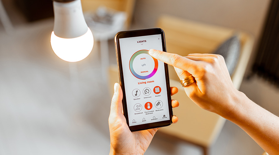
When general lighting is shared, it creates a neighborhood feel in a collaborative office. Lighting designers can give employees the ability to manipulate general lighting with controls. "If I think it is too bright I can dim it down, but I have to communicate with people in the immediate vicinity," Kaczkowski explains. "The ability to control lighting can be an opportunity for interaction among staff." According to Kaczkowski, people often prefer the lights turned down, especially if the staff is younger than 40 and using computers. But a finer level of control comes with higher levels of cost, which not all new projects can absorb.
When control systems are installed properly, they can dramatically reduce energy consumption, Graf says. The lights can be turned off when there is enough daylighting, and night controls can make the lights brighter when people are working.
Related Topics:


