External Aspects Of Healthcare Facilities Play Big Role In First Impression
Many factors are in play when it comes to creating a good first impression on patients — including many external aspects of the facility. There is the lobby, of course, but before that, there is the neighborhood surrounding the healthcare facility, the boundary of the campus, the wayfinding, the parking or valet experience, and the accuracy of the pre-visit directions. All are important parts of the initial impression.
For urban hospitals, there is not a lot that can be done about the surrounding neighborhood. If that neighborhood is viewed as unsafe, it can affect the patient's selection of their healthcare facility. At a minimum, these hospitals can create an oasis of safety and a clear line of demarcation for patients entering their campus. Each circumstance is different but establishing campus boundaries with green space and focused lighting instead of fences and barbed wire can reinforce how safe the hospital is as opposed to reinforcing how unsafe the surrounding neighborhood may be. These hospitals can work with their host communities through clinical outreach, planning, and zoning, and they can focus their real estate strategy on creating a safe corridor to their entrance.
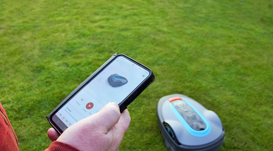
Patients need to be clearly told what building they will report to, where to park, how best to approach the campus from their neighborhood, and who they can call for additional help. Arriving patients are often anxious. In the digital age there is an app for that. New York-Presbyterian has launched the "FindNYP" app, a mobile guide to the main campuses. The app provides locations and directions to inpatient units, the emergency department, waiting rooms, and other services, as well as restrooms, elevators, places to eat, and more.
Even with the app, clear signage and graphics are essential. Directional and building signage should have the same names as the pre-visit communications — imagine the confusion for a new visitor when their appointment card says to park in "Garage A," but the campus signage points it out as "7th Avenue Garage" and the hospital employees know it as the "East Garage."
Hospital leaders should approach the campus as would a patient, both by car and public transportation, to ensure what they see exactly matches what is given in the pre-visit communication.
Related Topics:


