Color Does Not Have To Be A Challenge In Educational Design
Interior designers have a reputation among some school facilities personnel. As soon as the interiors people come, everyone flees. “I don’t want to talk about colors!” But color doesn’t have to be a challenge in educational design.
Interior designers have a reputation among some school facilities personnel. As soon as the interiors people come, everyone flees. “I don’t want to talk about colors!”
Too often, designers come to meetings and throw down five colors: “Here’s your color scheme.” Perhaps the explanation ends there. Or maybe they launch into a monologue packed with words like, “accentuate,” “subdued,” and “eclectic.” In either case, facility managers can feel disconnected from the discussion.
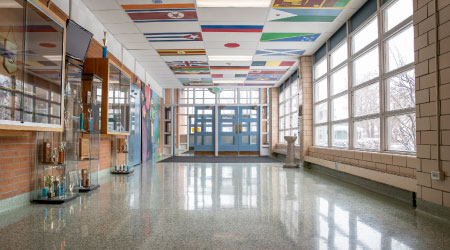
Despite these conflicts, the color discussion needs to happen. Consider Newark City Schools in Newark, Ohio. A prototype design allowed the district to build four new schools quickly and economically without losing quality. Each facility had the same materials and floor plan. So the facility manager and designers faced a challenge: how to set apart each facility so that students take pride in their school? The answer came in the form of color. A different color scheme gave each school its own identity.
The color scheme solution does not apply to every school district. The trick is to understand how relationship-based educational design can respond to the district’s mission and vision, and propel students to success.
For facility managers, the difference between the right color and the wrong color can also be the difference between a maintenance dream and a maintenance nightmare. For example, many schools choose semi-gloss white walls because one kind of paint is easy to stock and maintain.
However, there is a psychology behind color that shouldn't be ignored and colors support the way that educators use the space. An example: A tight budget challenged the conversion of a high school music room into a pre-K music room. Color came to the rescue. The use of primary colors proved an affordable way to make the space comfortable for its new users. White columns were painted red to increase visibility among young students. Red metal “roofs” at the tops of walls brought down the scale to make the tall space more home-like. Bright yellow walls appeal to the two-year-old’s energy, but also set limits to where he or she can be. Finally, dark blue circles on the carpet emphasize gathering spaces.
— Sylvia Kowalk, Douglas Ogurek, and Patrick Brosnan
Related Topics: