view all Case Studies
Drawing Upon Hospitality Influences To Reimagine A Library In Suburban Chicago
October 25, 2017 -
Design & Construction
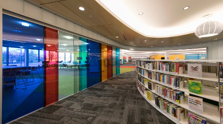
An extensive renovation to Indian Trails Public Library District in Wheeling, Ill., resulted in a modern and engaging learning space for the public. After a 15,000 square-foot addition, the library now occupies over 60,000 square feet and is well-equipped with more than just books – interactive labs and classrooms for community education programs, a dedicated youth area with puzzles and a large touch-screen monitor, and an overarching atmosphere that inspires collaboration and creativity.
The architects of Product Architecture + Design in Chicago drew influences from the hospitality industry when upgrading the Indian Trails Public Library, achieving an atmosphere that feels warm and welcoming, rather than institutional. A careful architectural balance is achieved with a juxtaposition of textures and finishes – heavy stone façades offset warm wood ceiling panels, while glass room dividers bring a lightness to the space. Instead of signs, architectural elements guide patrons throughout the library. Distinctive curvatures in the carpets, ceiling panels and light fixtures draw definition between zones in the library. Color also plays a role – the neutral first floor lobby is separated from the children’s area by bright bursts of color. Upstairs, the architecture takes a more linear and traditional approach with long rows of bookshelves, quiet areas and study spaces.
Lighting design also plays a prominent role in defining zones and creating a comfortable ambience within the library. To achieve even, high-quality illumination, a two-fold lighting approach was taken – custom luminaires were chosen for aesthetic impact, but a second level of illumination from powerful, minimalistic fixtures was also required. BASYS LED downlights from Zumtobel served as an unobtrusive, second-level lighting solution to produce the desired lighting effect.
Lighting design for Indian Trails Public Library District was a collaborative effort by Product Architecture + Design and KSA Lighting & Controls.
“With so many rich materials and aesthetically exciting elements, we didn’t want to detract from the design of the space. The BASYS LED downlights create a quiet, even feel that doesn’t draw attention away from the architecture.” –Tiffany Nash, Principal | Partner Product Architecture + Design
“We used lighting as a tool to pull people intuitively throughout the library. In this way, we could limit the amount of detracting signage and allow the architecture to remain the focus.” –Dan Pohrte, Principal | Partner Product Architecture + Design
“By balancing heavier and lighter elements, particularly with the luminaires, we were able to open up the space and not have it be too rigid. BASYS LED downlights almost disappear in the ceiling, allowing us to freely design around them.” –Jim Lonergan, Project Architect Product Architecture + Design
Next
Read next on FacilitiesNet


