Rethinking Office Layouts and Space Planning
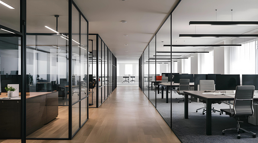
Ideas about office layout continue to evolve. "We went through the age of perimeter offices, with interior workstations," says Jennifer Nye, senior project designer with KlingStubbins. Many companies are now reducing the number of enclosed offices and moving those that are needed to the middle of the floor, with workstations and open areas along the perimeter. That allows more people access to daylight and facilitates collaboration and interaction between employees.
That has been a significant benefit at the newly designed headquarters for the pharmaceutical company, Novo Nordisk; KlingStubbins was the architect on the project. The office plan, which covers 160,000 square feet, includes about 65 percent workstations, says Nye.
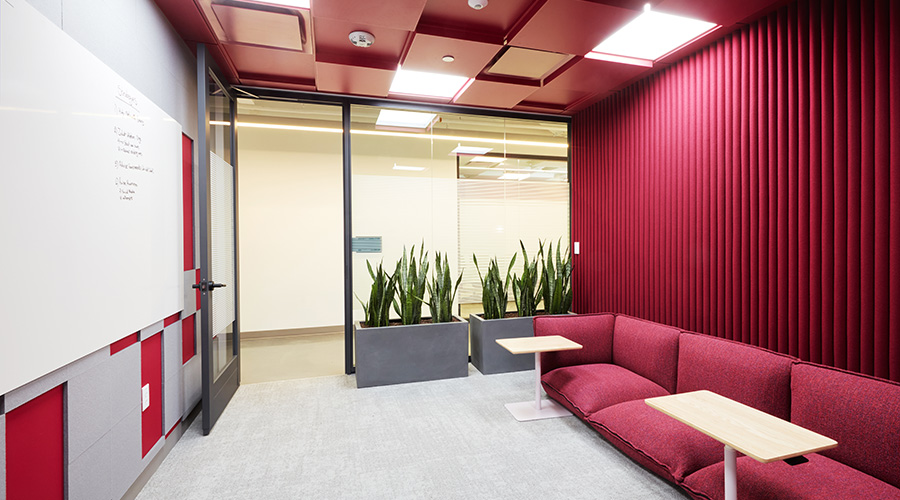
Workstations are grouped in clusters of 15 to 20 employees, each of whom is a member of a team. In addition, what are known as "huddle rooms" line much of the perimeter, and provide spaces for several employees to meet. "There's more opportunity for collaboration," says Nye. In a post-occupancy evaluation, 75 percent of respondents felt the space worked well, she adds. Because it's easier for employees to interact with each other, projects can move along more quickly.
Another recent sustainable project was the re-design of the offices of the Rockefeller Brothers Fund, a philanthropic group that provides grants to deserving organizations. The new design moved enclosed offices to the interior of each floor, with workstations located along the exterior of the floor. That's in contrast to the previous layout, which incorporated a larger number of private offices, most of which were along the perimeter of the space. "It really gave a sense of the haves and the have-nots," says Daniel Jacoby, AIA and associate principal with FXFOWLE, the architects for the project.
The new design facilitated a change in the workflow. Previously, files holding the paperwork of each potential grant recipient would travel from one person's office or workstation to the next. The process was cumbersome, and it was difficult to keep tabs on the files. Now, the paper stays in a central "grants hub" and employees who need to access it go to the hub. "It forces people to talk to each other," Jacoby says. This also eliminated the need to track the files. The result? The entire grant approval process has been streamlined.
Although some management teams remain leery of the idea that employees may socialize on the job, workplaces that encourage collaboration and socialization actually enhance productivity, says David Loyola, design director with Gensler. According to the 2008 Workplace Survey by Gensler, the workplaces of top-performing companies are about 20 percent more effective in supporting collaboration and socialization.
Gensler's design for the 10,000-square-foot offices for Glumac, an engineering firm, incorporates a common lunch area, "the café" that is "the focal point of the space," says Loyola. The space allows different departments, including the mechanical, plumbing, electrical engineers and commissioning groups, to run into each other.
Pride in the Workspace
SmithGroup employed many of these principles when designing the new offices for Burgess Group, a software and consulting firm, such as providing employees with some access to daylight. According to feedback from the management team, employees take a great deal of pride in working in the space, Moylan says. That should translate to greater productivity.
While certain firms, such as ad agencies, seem tailor-made for open office plans, more traditional companies can incorporate many of the principles and reap the benefits. The new Chicago headquarters of Mesirow Financial, a financial services firm, is a case in point. The 320,000-square-foot space includes about 60 percent workstations and 40 percent offices. Workstations are 90 percent modular, while the office walls are demountable, says Ann Marie Krol, senior designer, IA Interior Architects. As a result, most employee moves and changes can be done in a weekend. Previously, moving one employee could take up to a week, due to the demolition and rebuilding required.
Equally important, the new design consolidates support space, such as copy, conference and break areas, into one area on each floor. At the company's old offices, copy and break rooms were scattered throughout various departments. By consolidating these areas, as well as reducing the average size of workstations and offices, the company reduced the space it needed by about half. Limiting each floor to one support area also means that employees from different departments are more likely to cross paths. "The business units talk to people they wouldn't on a regular basis," Krol says.
When it comes to office lighting, a rethinking also is underway, says Loyola. Many sustainable office designs rely less on overhead light, and more on daylight and task lights.
Green workplaces use several techniques to bring outside sunlight to as many employees and as deep into a space as possible. One is through the layout of the floor. Because workstations and casual, open meeting areas are being placed along the perimeter of a floor, with enclosed offices in the center, "light is a communal thing, versus someone's individual possession," says Jacoby of FXFOWLE.
This was the approach FXFOWLE used when designing new offices for the National Audubon Society, Inc. "Everyone has access to views and light, no matter where they're sitting." In addition, sensors are built into the overhead lights, dimming them as the sunlight gets brighter.
Related Topics:


