Breathing New Life Into an Old Landmark Building
A museum facility has been rehabilitated into a LEED Gold life sciences building at the University of California, Berkeley.
By Ken Lidicker, Contributing Writer
In 1965, Mario Ciampi and associates Richard L. Jorasch and Ronald E. Wagner won a competition held by the University of California, Berkeley, for the design of the University Art Museum. Their winning concept opened in November of 1970 and was met with great acclaim. Alfred Frankenstein of the San Francisco Chronicle called the project the “Bay Region’s first thoroughly modern museum structure — a major work of art in itself.” The Berkeley Architectural Heritage Association later wrote, “the University Art Museum (BAM) is considered a masterwork of modernist design and has been called a ‘visual masterpiece.’ In its sculptural forms, it outstandingly exemplifies the Brutalist style of its era. Especially impressive is the unique complex formed by the soaring atrium and spirals of multiple galleries and ramps, designed by Jorasch and Wagner. Also visually powerful is the building’s exterior, which strongly reflects the interior layout and presents staggered Cubist masses that rise and shift direction compellingly. BAM is a prime example of work by the office of Mario J. Ciampi (1907–2006), an important Bay Area architect and urban designer with a distinctive modernist flair.”
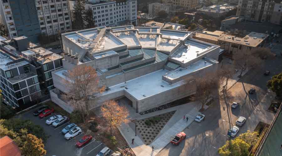
Fanning out like a hand of cards, the building consisted of two subgrade levels and two above-ground gallery levels with floors at varying heights. The building’s structure was designed with six “trees” that function as shear walls with cantilevered beams to hold up the various floors, each connected on one side with an expansion joint that continues up to the roof, allowing for natural expansion and contraction. Stepped galleries overlook the dramatic central atrium. Later renamed Berkeley Art Museum & Pacific Film Archive, it is widely revered as one of the finest examples of Brutalist architecture and often compared to Frank Lloyd Wright’s Guggenheim.
In 1997, the University deemed the building structurally unsafe. It was determined that the necessary retrofitting would compromise the exhibition spaces. In 2001, while a new museum site was being determined, temporary steel braces were added to the building’s exterior as a partial solution until the museum could be relocated in 2014. Once vacated, attempts were made to repurpose the building, none of which were successful, and there was mounting pressure to tear down the architectural wonder.
New life not without challenges
A private/public partnership with the University of California, Berkeley, and Bakar Labs, the current project began in 2016 with a feasibility study by the architect, which determined the exact renovations needed to make the building well-suited for life science laboratories while preserving the structure’s historical significance. The goal for the new use was to bridge the gap between UC students, life science startups, and established biotech companies by providing well-equipped research space, which is typically cost-prohibitive for young companies.
The rehabilitation was especially challenging because of the building’s unusual geometry, irregular floor levels, and all-concrete composition, which made modernization of infrastructure especially difficult while preserving the integrity of the original material and concealing new systems.
In order to ensure that all proposed retrofits necessary for the rehabilitation were sensitive to the building’s historical importance and character, the team studied the cultural and aesthetic factors which contribute to the building’s historical importance. The study highlights the building as a major sculptural statement in itself, citing the repeated, stacking, board-formed masses of the exterior facade, the dramatic, cantilevered switchback ramps of the Upper Gallery, the deeply recessed glazing, and the sky-lit double-height central gallery space all as primary historically important character defining features. Also noted is the experience of circulation through the building using the existing ramps, which soar into the double-height space and hang improbably in the air.
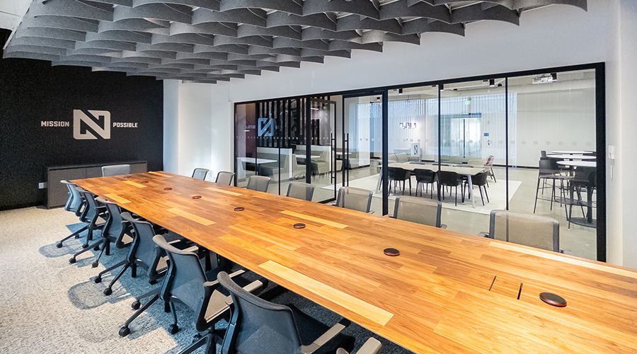
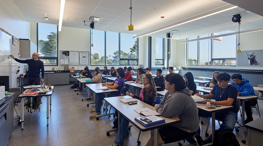
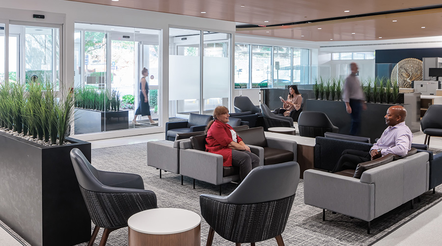
Programmatic elements of the new space include a laboratory, open office areas, collaboration spaces, private offices, conference rooms, an auditorium, an undergraduate program space, terraces, and public outdoor spaces. The team developed a cohesive conceptual program layout which protected and responded to these primary character defining features, while not adversely affecting the functional use of the space.
Additional square footage was required for the new use, so a 6,600 square foot expansion was added, sitting below the cantilevered mass of the Upper Galleries. It is designed to be both physically and aesthetically separated from the original concrete form of the building. The expansion façade is composed entirely of glass and metal, intended to feel light and delicate as a contrast to the weight of the concrete above. Two new public plazas activate the frontages along Bancroft Way and Durant Ave, which previously lacked substantial public space.
Significant issues, such as seismic performance, water intrusion, and acoustic performance, were addressed while bringing the building up to code. The seismic retrofit used a non-linear response history analysis to incorporate actual earthquake ground motions and non-linear properties of the existing structural elements into the design. This retrofit includes new buckling restrained braced frames and foundations while utilizing as many existing building elements as possible, including the steel braced frames added in the 2001 temporary seismic upgrade project. Brace framing was added along the demarcation line between the areas deemed of primary and secondary historical importance, creating glass front labs where the museums galleries once were and preserving original circulation routes and views around the central atrium.
Mechanical, electrical, and plumbing infrastructure was overhauled, including the replacement of existing gas service with all-electric systems, allowing the project to achieve low EUI, operational carbon neutrality and Net-Zero HVAC water-use as well as meet LEED Gold requirements. Because the building is nearly all concrete, including floors, walls, and ceilings, the team was challenged to make all upgrades, including new modern lighting while minimizing the amount of cutting required of the original structure.
Opening in 2022 as a vibrant center for life science innovation, Bakar BioEnginuity Hub gives this iconic structure an exciting new life and brings the landmark back to its former glory as a significant part of campus. In a building nearly devoid of right angles, researchers now employ out-of-the-box thinking with Ciampi’s awe-inspiring design as the exhilarating backdrop, forging optimistic new solutions for a better future.
Ken Lidicker is Senior Associate at MBH Architects.
Related Topics:


