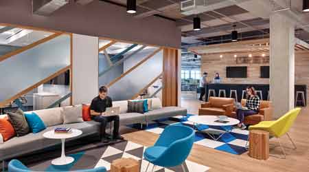
 It is becoming standard practice to provide informal areas for relaxation and collaboration, with a hospitality aesthetic and residential comfort. Accenting these lounges with extra amenities such as a coffee bar can ensure they stay activated all day.Photo Courtesy of lauckgroup
Why Office Design Should Reflect Corporate Culture
It's not just a branding and amenities thing - though those are part of it. Office space and workstation must give employees a sense of what the organization is and how it operates.
There are other ways to redesign a culture-focused office without overspending on flashy amenities. One way to do this is through subtle branding. It was common for startups to reinforce brand elements, such as giant neon logos or graphic company taglines plastered on the walls, to provide a sense of culture. However, as those companies have matured, so too has the representation of the company brand and culture through architectural gestures, material selections, and planning strategies that create a tangible experience of the brand. As a result, facility managers working for companies that have less of a need to underscore their brand can translate expensive signage into office features, allowing the brand to be experienced rather than seen.
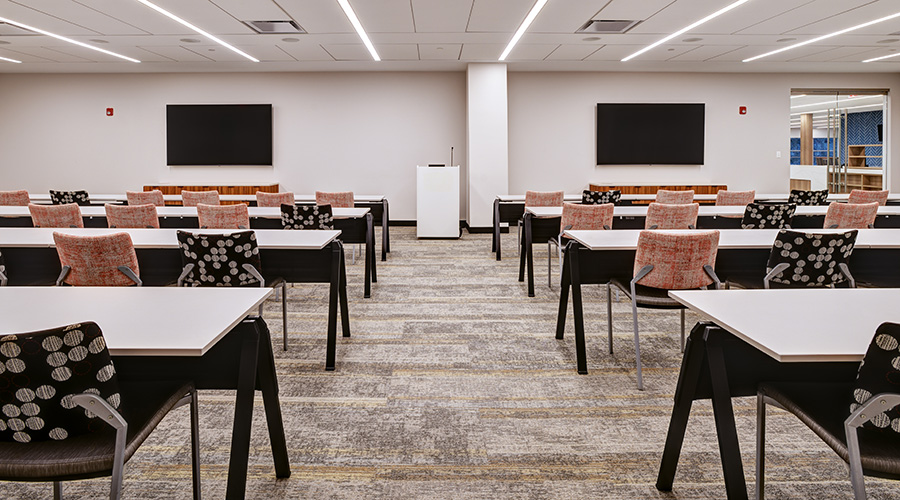
During the recent expansion of one office, the design team worked closely with the company’s internal culture and facility staff. The goal for the expansion was a bridge between the existing space — built by the same design team nearly four years prior — and the company’s new branding and evolved culture to create unexpected experiences when employees turned a corner. The focus then became less on branding the space through the use of the company’s logo and more on thoughtful selections of materials, furnishings, and emotions created through lighting and architecture. Spaces intended to be more intimate required warmer lighting, lower ceilings, and drapery and lounge furnishings. Open work areas are lit with cooler lighting, open ceilings, and power along the floor at every 15 feet with completely mobile sit-to-stand desks to allow each team to configure its area as it likes — giving all employees a choice in how they work.
Rather than taking a solution that worked for another company and directly replicating it, it is important that organizations go through the vision and programming exercise to understand where the culture is now, where it is heading, and how the new office can support that. It’s far too easy to get swept up in the trends and for office spaces to become a quiltwork of flashy solutions. Many of those ideas might seem fun, and there is certainly a place for them in some offices, but untailored solutions will not further company goals. Rather, if the design of a workplace truly represents the organization, it has a soul; people can feel it as they walk in. It becomes a tangible experience of a company’s culture instead of simply just an office.
Raul Baeza (info@lauckgroup.com) is an associate/senior project designer for interior architecture firm lauckgroup, which designed Atlassian’s Austin office. Baeza’s project experience includes Google Austin Offices SB and UP, Galvanize, Dropbox Austin, LegalZoom, Cirrus Logic Environmental Graphics, and Home Away Domain.
Email comments and questions to edward.sullivan@tradepress.com.
Related Topics:


