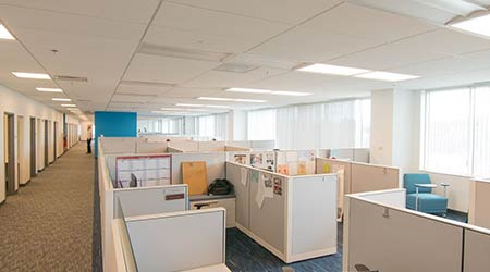
 Standardizing office and work station size can greatly reduce overall square footage needs.Photo Credit: Duncan Lake of Cresa Boston
Two Case Studies Show Benefits of Right-Sizing Office Space
These two real-world examples show how organizations are using office space to encourage collaboration, promote productivity, and plan for the future.
Office space requirements must reflect the ongoing shifts in multi-generational workforce demographics to prepare for the expected transition as retiring Baby Boomers are replaced by Millennials who possess different work styles, expectations, and preferences. Space planning that supports flexibility, collaboration, and activity-based work can help maximize efficiency and prepare for this future. To satisfy immediate space needs as well as projected growth, companies would be wise to build in extra conference rooms or soft seating areas that can transition into office spaces or workstations.
With the high cost of real estate, encouraging remote work and maximizing space to save on occupancy costs is a smart business choice. Forward-thinking companies right-sizing their real estate are achieving more than a reduction in rent. They are realizing an increase in performance and innovation with a more engaged and productive staff.
Two Projects Show Results of Right-sizing
The Bridgespan Group, a nonprofit advisor and resource for mission-driven organizations and philanthropy, was planning a lease relocation and expansion of their Boston headquarters. Their former offices had a more traditional layout; offices situated along the perimeter of the building blocked natural sunlight from entering, and outdated furniture and crowded common areas created a “maze-like” feel to the space. The goal of the relocation was to consolidate the company’s multi-floor operations into a more efficient single floor suite.
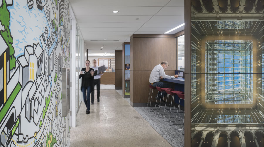
The new space features an open environment that encourages collaboration and promotes productivity while meeting the needs of Bridgespan’s employees across all departments. Key features of the project included:
• Open, bench-style workstations with no assigned seating.
• Small and mid-size conference rooms located toward the center of the office.
• Private phone booths for employees to take personal calls.
• A locker room to store coats, bags, and other personal belongings in a safe, secure location.
• Kitchen and dining area with three refrigerators, coffee makers, and a food preparation area.
• Natural light from the internal windows surrounding the building’s central atrium penetrates throughout the space.
• Modern furniture and finishes.
• Exposed concrete ceilings fused with bright splashes of green, yellow, and orange along the phone booth and conference room walls.
Helen of Troy: More Efficient, Organized
A second project shows the impact that right-sizing can have on an organization.
The U.S. headquarters of the Health & Home segment of Helen of Troy, a global leader in branded healthcare devices and home comfort products, sought a more efficient and organized office and lab environment that would foster a greater sense of community and collaboration when nearing the end of a 20-year lease. The relocation gave Helen of Troy an opportunity to have the layout of their operations redesigned and to upgrade the level of finish, improving the overall aesthetic of the work environment to help attract and recruit talent.
The new 65,000-square-foot U.S. headquarters features an open and efficient floor plan with low-height workstations and glass-front offices that surround a core of support service spaces and collaboration areas. It provides space for offices and workstations, a customer service call center, a conference center, showroom space, and research and development laboratories.
At the heart of the space, a large reception and gathering area serves as the hub of the office for employees and visitors alike. The branded reception and lounge area, with a folding glass wall to the elevators for off-hours security, welcomes visitors to the office. The reception lounge features two conference rooms that double as showrooms with product shelving and glass display cases. On the other side of reception, a café gathering space provides vending and water filtration machines along with a variety of casual seating options, including tables, soft seating, and booth seating along the window line. This central gathering space features an exposed deck ceiling and polished concrete floors, and can accommodate many people for socializing or casual collaboration. The design takes advantage of the building’s extensive window line to extend natural light deep into the space.
Adjacent to the reception and gathering area, the new design features research and development and product testing laboratory space with 11 labs set up for testing product, including an acoustical testing chamber. A corridor runs in a loop through the glass-front lab area, providing a convenient visitor tour that concludes into both the gathering area and conference center. The center features three large conference rooms with movable walls that open to accommodate 200 employees for a company meeting.
Amy Braun (abraun@cresa.com) and Barry Dube (bdube@cresa.com) are senior project management staff at the Boston office of Cresa, the world’s largest tenant-only commercial real estate firm. Cresa facilitated lease expansion and relocation for the Bridgestone Group and provided project management for Helen of Troy. The new Helen of Troy headquarters was designed by Margulies Perruzzi Architects.
Related Topics:


