Signage Leads the Way
Facility signage goes beyond just the writing on the wall
By Lacey Muszynski, Assistant Editor
Sometimes, with a little inspiration, an undistinguished everyday object can turn into something extraordinary. As one large paint manufacturing company found out, paint swatches, which have a clearly defined role in the design world, can act as much more than a design tool.
At the company’s headquarters, employee cubicle nameplates are now equipped with an additional small window designed to hold the company’s paint swatches. Employees can switch out their swatches as often as they like, reflecting current moods, holidays or new favorite colors. It was a small change, but after it was made, morale and camaraderie among the employees rose — as did product knowledge — all without hours of expensive team-building exercises, company picnics or training sessions.
Facility signage can accomplish more than facility executives might expect. With the small imaginative addition of interchangeable paint swatches, for example, this organization is taking steps toward a creative, personalized work environment.
Benefits, Not Just Requirements
Facility signage should be thought of as a valuable asset to a facility, not just a requirement. “Signage is more of a marketing tool than anything else,” says John Bosio, associate principal with Hillier. “When visitors can find their way easily, they’re more likely to come back and tell other people about their experience. Good facility signage adds a positive experience for the visitor.”
Signage can be much more than just a plaque on the wall, says Jeffrey Cook, studio director for the brand strategy and graphic design division at Gensler. “Ideally, we try to express the organization’s core values and brand through the signage system. It creates an environment that’s more exciting, more pleasurable to work in and brings the company closer together,” he says. “It’s a relatively simple and effective way to bring an emotional connection to the facility. You need signs anyway, so why not have them perform double duty?”
Intangible goals such as these should be established at the beginning of the design consultation process, says Gregory Straub, associate for the architecture studio at Cubellis. Facility executives should expect certain goals, such as maintaining good pedestrian flow, decreasing congestion and complying with the law, but other potential benefits should be discussed with the architect or designer.
Design experts agree that these consultations should take place as early in the construction process as possible. Often, experts say, signage is one of the last components of a facility considered in the design and construction process. If this happens, there may not be enough time to have the signs produced. Designers also don’t have the opportunity to consider the signs as closely as they might want. This sometimes leads to new facilities opening with handmade signs on foamcore — a look less-than-professional for a new facility. “We’d rather get involved early in the process so signs can be done and installed when they need to be,” says Cook.
The amount of planning and fabrication time required depends on the size of the project. Outdoor architectural signs can add lead time because of the complicated fabrication process. For a single floor of an office building, expect five to six weeks of planning and design and a four- to six-week production period, says Cook. Larger projects, such as a university campus, may take six months of planning and eight to 12 weeks for fabrication, says Bosio.
During early design consultations, facility executives and designers should discuss purpose, says Cook. It’s all about space planning and knowledge of function, he says. “Who would know the facility better than the facility executive?” says Mark Campione, project manager at Cubellis. “They know the ins and outs of the facility, and as designers, we look to them for that crucial information.”
One major consideration is the level of changeability or flexibility required. Because of turnover and the trend toward flexible open office space, signage changes often need to be completed quickly, simply and cost-effectively. Many sign manufacturers are responding to this need by creating signs with windows that allow facility occupants to print out a new nameplate or other information as needed without ordering new signs.
Other Ways to Find the Way
Wayfinding systems for facility visitors are based on trust, says Bosio. “If a visitor sees the same system over and over, and placed in the same spot with consistent sizing, they’re going to trust it better,” he says. “If wayfinding signage is worn, damaged or temporary, people won’t pay attention to it.”
Facility executives shouldn’t think of wayfinding as just a network of signs, however. There are many ways to delineate certain areas of a facility. “We try to help people find their way with the smallest number of signs possible,” says Bosio. “Look at the whole environment to determine if there are other clues to help people find their way.”
At one health care facility, the elevator lobby on each floor was used as an exhibition and donor recognition space. As visitors exit the elevator, they’re presented with a different landmark on each floor. If they forget on what floor they need to exit facility, these landmarks act as a visual cue to help them remember what floor to use.
In spaces such as malls, color schemes are often used to help visitors orient themselves. For example, one large anchor store may be assigned the color red. In that wing of the mall, red is the accent color in flooring, seating, signage and even lighting. These design elements help visitors realize which direction they are heading without the need for additional signage. When visitors enter another area of the mall, they might realize they’re heading toward the food court because of a specific pattern in the flooring. “Wayfinding is more than just a series of signs,” says Straub. “It’s the complete package. It’s everything that goes into orienting oneself.”
For wayfinding systems that are installed or revamped in existing facilities, before-and-after surveys can help quantify the benefits of the new system. Before the renovation takes place, survey visitors to gather information such as how long it took them to reach their destination and whether they felt the signage was confusing. It’s also important to poll facility occupants and employees about how much time they spend explaining to visitors how to navigate the space. Often, this is seen as time and money out the window if that isn’t the primary job of employees.
After the new wayfinding system is in place, conduct the same surveys a second time. Problems should have been remedied and user satisfaction — both visitor and employee — should rise.
ADA Guidelines
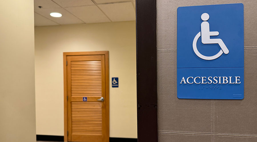
The Americans with Disabilities Act (ADA) mandates certain characteristics of signs that designate permanent rooms or spaces and signs that provide directions or information. Some include:
Copy Height. Permanent room identification signs must have raised, uppercase copy at least 5⁄8-inch high but no higher than 2 inches. Grade 2 Braille must accompany the copy. Overhead signs must have 3-inch high copy minimum. Exterior traffic signage copy is dictated by the speed of passing vehicles.
When designing exterior pedestrian wayfinding signs, John Bosio, associate principal with Hillier, recommends avoiding copy between 1 1⁄2-inch and 4 inches high. Copy in this range may cause drivers to slow down to read signs that don’t pertain to them, causing delays. Copy below 1 1⁄2-inch is suitable for pedestrians, he says.
Contrast. The contrast between the background of the sign and the copy color must be 70 percent dark to light or light to dark. “Some facilities don’t like the contrast that harsh,” says Jeffrey Cook, studio director for the brand strategy and graphic design division at Gensler. But that level of contrast improves legibility, especially for people with visual impairments.
Mounting Position. Room identifying signs must be mounted on the knob side of the door at a height of 60 inches to the center of the sign. Overhead signs must have an 80-inch clearance.
|
Mindfulness Matters
It’s important for facility executives to examine sign content, location and context within the facility. Here are some important things to consider:
Keep the amount of information on each sign reasonable. If a sign lists 15 things in a row, people are less likely to pay attention to it. Where long lists cannot be avoided, such as listings of doctors offices in the lobby of a health care facility, present the information in a simple, organized manner.
Double check to be sure signs are being installed in the correct locations, especially if a design or architecture firm presents the exact locations of signs in an elevation format. Installing a sign in the wrong location or at the wrong height could mean spending money on repositioning it and repairing the first location, or even having to purchase a new sign.
If a facility is aiming for LEED certification, keep in mind that educational signs about the green aspects of the building may earn LEED points.
|
Related Topics:


